 Tweet
Tweet
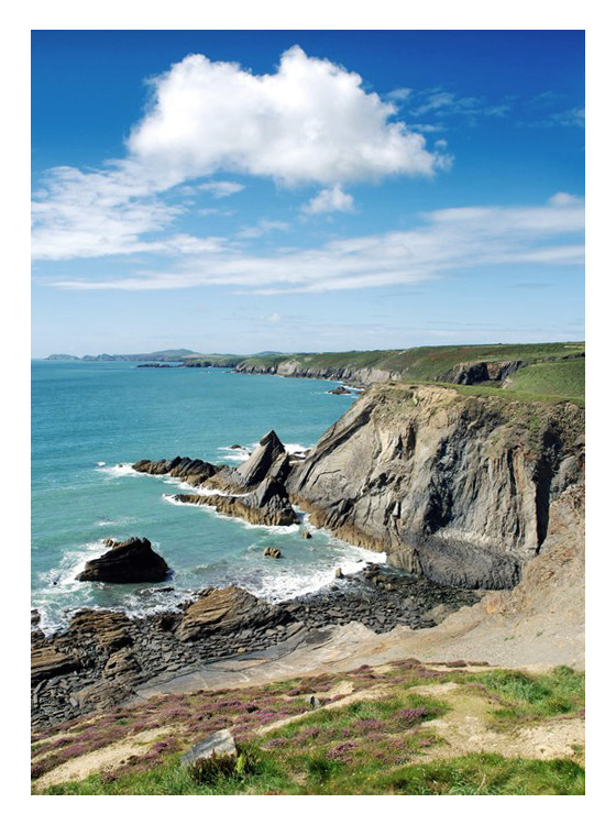
Part of my new series of photographs, Evermore. These photos were taken in Wales, specifically near St. Davids along a coastal walk. My aim was to capture many of the different elements of nature. Both photos were taken with the following specifications:
Camera: Nikon D80
Focal Length: 18mm
Aperture: F/8.0
Shutter Speed: 1/200 sec.
ISO: 100


I would appreciate feedback on which one you prefer, why you prefer that photograph and how I could improve them both. Thanks for viewing and your time
Matt
Camera: Nikon D80
Focal Length: 18mm
Aperture: F/8.0
Shutter Speed: 1/200 sec.
ISO: 100
I would appreciate feedback on which one you prefer, why you prefer that photograph and how I could improve them both. Thanks for viewing and your time
Matt


Comment