Originally posted by Stephen
View Post
-
 Guest repliedRe: Karst Moon
I found this crop works best on your first image. The extra colour just makes the difference. -
Guest repliedRe: Karst Moon
If you must keep the moon then yes the second version is best, but I still think the first version cropped just above the tree makes a better image. This then looks more panoramic and for me makes the wall pop out of the frame.Leave a comment:
-
Re: Karst Moon
Originally posted by Stephen View Post
Erm ..... having seen your latest desat version I must admit David was right about the desat. He's been looking over my shoulder, grinning and nodding his approval of this latest version.
The desat works very well ...... so 10/10 for you and Gert. You were both right and I was wrong.
PolLeave a comment:
-
Re: Karst Moon
I do prefer the desat one. But the composition as a whole is a little flat for me - I have found from personal experience its quite hard to make a nice composition with the stone walls although when you are actually outside among them they look amazing capturing them effectively in a frame is another story.Leave a comment:
-
Re: Karst Moon
Pol, once again thanks for your great comments and opinion of the picture. I have had another look at the shot and modified it along the lines of your suggestions. Obviously the first shot looked a little saturated, the low afternoon sun gives that effect with the long shadows. However I quite like the desat suggestion, I have only yesterday seen another shot taken by Bearface which he used the same effect and it worked for me. He may show it if he sees this.
Anyway, this is my modified desat version, both the sky and land were given levels of desat and the contrast on the land was increased in curves

Leave a comment:
-
Re: Karst Moon
How perceptive of you Tinka and many thanks for your comments. You are right, the original image did not have the moon in the shot, however I felt it needed something to fill the space on the top left so I cloned the moon from another shot taken a bit later. I thought it worked well. However this is exactly the reason the image is posted here, for others opinions.Originally posted by Tinka View Post
The other picture with the moon is in my gallery so here it is

Leave a comment:
-
Re: Karst Moon
It just so happens I've been going back and forth pondering this particular series in your gallery. I liked your approach in shooting the location from various angles and perspectives, liked aspects of all the shots - but have to say this one was my least favourite of the 3.Originally posted by Stephen View Post
What I like about this one is the feeling of wide open space, also like the clear sky and details seen on the moon. Composition is nice, no problems with that as far as I'm concerned. I can't quite put my finger on is why it just doesn't grab me like the others did.
We've been having one of our 'debates' this end and also disagreements. David suggests desaturating more - my own feeling are that it has more punch when it's a touch more saturated. He says 'more watery/pale' I say more saturation - which also gives the shadow of the tree more contrast/punch imo.
I took it into CS2 (removed the frame) converted to Lab Colour >> Channels then .... on the (a) and (b) channels I used a curve adjustment at about 10%(ie I slid the top and bottom a touch from edge towards the centre by about 10%) to boost and 'pop' the colours a little more.
The end result boosted the colours and contrast slightly and I preferred the effect .... but David didn't agree, said my effort was too rich, the grass should be "poorer" and that my tweaks were "not representative of Limestone landscape" but .......... I still think a touch of careful colour boost and the contrast that inevitably goes with it (via curves in lab mode channels (a) and (b) might make the wall, tree + shadow and sky 'pop and grab' and hold the attention a bit more.
PolLeave a comment:
-
Re: Karst Moon
Hi Stephen,Originally posted by Stephen View Post
I like this image, I think the scene is well ballanced with tree in the right place, and the other details fall into place. The light cast suggests a late evening shot? and it warms the image nicely, I like the way the wall takes the viewer across the image from right to left and back again, allowing the viewer to take in the whole of the image detail. However as a photograph/landscape image I am not sure about the moon, I personally feel that it makes the image look "constructed" from two or more images, "If it is, it is extremely well done", even though the sky lacks detail; ie; clouds etc: The introduction of details such as this would inprove the image a great deal. "This is just my opinion/observations and does not mean I could do any better".Leave a comment:
-
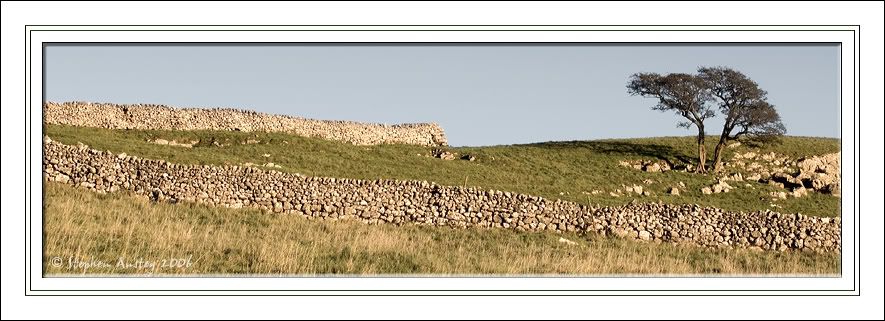
Karst Moon
Karst, for those who don't know is the term for Limestone scenery. This shot was taken in the limestone hills around Malham in North Yorkshire. Appreciate your opinion and feelings on the shot, could it be improved?

Leave a comment: