Announcement

Collapse
No announcement yet.

New Heights - colour or b&w?

Collapse
X
 
  • Filter
  • Time
  • Show
Clear All
new posts

  • New Heights - colour or b&w?

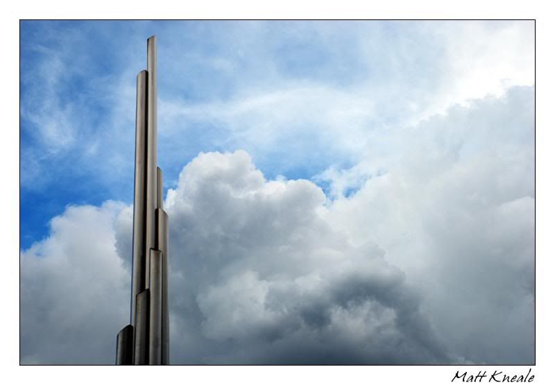
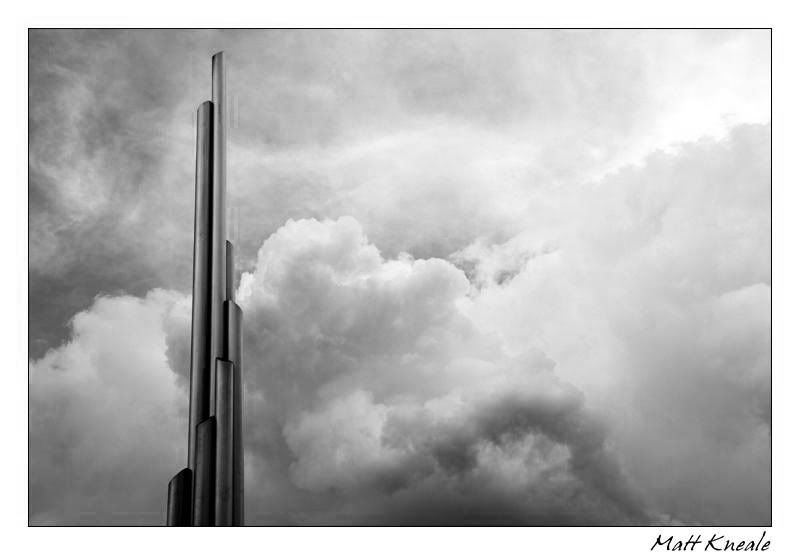
    Hey folks, i'd love to know your opinions of the following images, and whether or not you prefer the B&W version to the colour? I'd gladly appreciate critique on all aspects of the images, however.

    Picture information
    Camera: Nikon D80 with 18-70mm lens
    Focal Length: 31mm
    Aperture: F/7.1
    Shutter Speed: 1/200 sec.
    ISO: 100
    Edited in Adobe Photoshop 7.0 (levels and curves) and shot in JPEG format


    Thanks for viewing
    Matt

  • #2
    Re: New Heights - colour or b&w?

    I like colour best, the B&W seems a little to plain possibly. Kind makes me think Pink Floyd...

    Comment


    • #3
      Re: New Heights - colour or b&w?

      Hi Matt,
      I have to agree with the Pink Floyd theme,
      I like both images, the color one could almost be a selective mono/color image, with the grey art work standing in contrast with the color sky, However I come down on the side of the mono image, a few tweeks in PS could make this image very dramatic indeed.
      Catch Ya Later
      Tinka

      Comment


      • #4
        Re: New Heights - colour or b&w?

        The sky seems a bit to intense in the colour and makes the subject appear a bit flat.
        I go for the mono but maybe a bit of contrast to give it some ooomph would help it stand out more
        -------------------------

        Comment


        • #5
          Re: New Heights - colour or b&w?

          I played with this last night.The B&W comes out really nicely with masking the object off & adjusting the highlights and contrast of the sky, really brings out the clouds.

          Comment


          • #6
            Re: New Heights - colour or b&w?

            Originally posted by 19ninety View Post
            I played with this last night.The B&W comes out really nicely with masking the object off & adjusting the highlights and contrast of the sky, really brings out the clouds.
            I'm sure Matt won't mind if you show it to us.
            -------------------------

            Comment


            • #7
              Re: New Heights - colour or b&w?

              Originally posted by Pops View Post
              I'm sure Matt won't mind if you show it to us.
              DOH, I kninda love and hate a challange, heh e, ok, heres two, ones with light editing and the other is with a heavy dose of highlights and contrast... both roughly masked so maybe a bit white on the edges, hope Matt doesnt mind me slaughtering his images

              Light:


              Heavy:

              Comment


              • #8
                Re: New Heights - colour or b&w?

                I must say that I like the original monochrome the best. But I may well be in the minority . . . I often am!

                Comment


                • #9
                  Re: New Heights - colour or b&w?

                  Originally posted by 19ninety View Post
                  DOH, I kninda love and hate a challange, heh e, ok, heres two, ones with light editing and the other is with a heavy dose of highlights and contrast... both roughly masked so maybe a bit white on the edges, hope Matt doesnt mind me slaughtering his images

                  Light:


                  Heavy:

                  I do like how you've edited them (and of course I don't mind you slaughtering my images! In my opinion anyone who posts an image in this board is asking for it :P)

                  I like both the light and heavy editing in different ways. The light editing really brings out the sky in a more mischievous way, and the heavy brings out the structure and clouds in a way that I much prefer! Thanks

                  Matt

                  Comment


                  • #10
                    Re: New Heights - colour or b&w?

                    Thanks Kurt, i'm glad you liked it

                    Comment

                    Working...
                    X