If this is your first visit, be sure to
check out the FAQ by clicking the
link above. You may have to register
before you can post: click the register link above to proceed. To start viewing messages,
select the forum that you want to visit from the selection below.
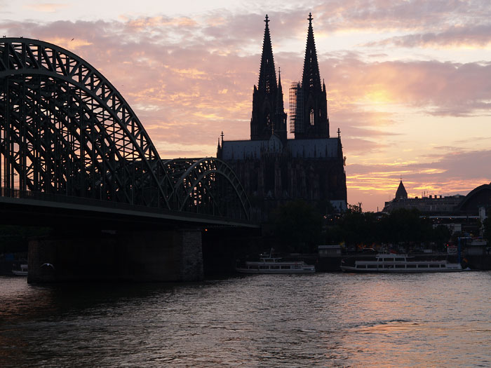
This is a Photoshop CS2 HDR merge of three bracketed exposures (though only -0.3 to +1.7 EV). It has preserved the sky well, but not lifted that much of the dark areas.
I think +/1 3 stops might have produced a more interesting result, but what do you think?
Just for interest, here is the camera JPEG of the darkest (-0.3 EV) of the three donor images. The actual merge was made using RAW files. I used an Olympus E-330 with 14-54 lens @f/5.6 perched on top of a wall, using a pencil under the lens to keep the camera steady and pointed upwards enough, above the embarcation point for the cross-river ferry boat.
I think it's a beautiful shot! The sky is wonderful and there are also loads of details to be seen in the landscape.
I can also see what Stephen means about there being a more potential for 'lifting' the land details - though I reckon he's slightly overdone it and made it just a tad too light. However, we do sometimes differ slightly over where to 'stop' -- I lean more towards the subtle approach.
I'd say there's probably an optimum point somewhere between Ian's first image and Stephen's tweak.
Hi Ian,
I like your rendition, as being natural. Since the light source is in your picture, bringing up the shadows, as Stephen has done, implies another light source and that sends my intuition scrambling for an answer....
Bob
I love the first image and I think the shadows actually add atmosphere which is lost with too much lightening.
Thanks Jo - far be it for me to comment, but I tend to agree with you!
I have passed the original RAW files to Danny Chau as a kind of challenge for him to do better - he reckons the shadows aren't contrasty enough in my version
Thanks Jo - far be it for me to comment, but I tend to agree with you!
I have passed the original RAW files to Danny Chau as a kind of challenge for him to do better - he reckons the shadows aren't contrasty enough in my version
Watch this space!
Ian
I really like it Ian, again, I like to see silhouetted buildings, it adds to the atmosphere. I also like the inclusion of the bridge as it draws the eye forward to the cathedral.
(by the way, Danny Chau, he carrys out critique in a Digital Photography magazine does he not?)
Against the light you can't expect there to be detail in the dark areas. It wouldn't be realistic anyway. I think it looks fine as it is. The last time I saw it was from the back of an army transport in 1945. It was surrounded by grassy hills which was all that was left of the buildings of the city. It was rather uplifting.
Against the light you can't expect there to be detail in the dark areas. It wouldn't be realistic anyway. I think it looks fine as it is.
I hear what you are saying here Nitfie, but I can't totally agree with you. The fact is that the human eye sees detail in a scene that normally the camera either film or digital may struggle to do so. Indeed Ians attempt at HDR was to counter the limitations of a single exposure. So in the first shot, the HDR version is showing more detail that would normally be seen as can be sen by the next image. I would argue that the eye would see even more, hence my attempt to pull some of this out. The sun is clearly not casting its warm glows on the cathedral but the eye would not see it as a dark mass necessarily and I see no problem in trying to see shadow detail, albeit darker than a sunlit area.
I really like it Ian, again, I like to see silhouetted buildings, it adds to the atmosphere. I also like the inclusion of the bridge as it draws the eye forward to the cathedral.
(by the way, Danny Chau, he carrys out critique in a Digital Photography magazine does he not?)
Thanks, Ben.
What do you think of Danny's version?
I'll ask Danny about Digital Photography mag, but I think you might mean Will Cheung from Photography Monthly?
Well here's what I think of it- though I've only had a few minutes to look at it.
I d/l the full size copy, viewed it at full screen and my immedicate reaction was ............ by heck! That's a picture that certainly pops! Great impact at full screen, superb processing bringing the Cathedral and far share to life.
Next I resized Danny's to the same size as Ian's version. I wanted to compare them side by side. Danny's still 'pops' - beautiful processing.
The way the bridge leads the eye to the Cathedral is super composition from Ian - the way Danny enhanced the impact of both the bridge and Cathedral by working on the light and contrast brings the entire scene to life. It's fabulous at full screen (I viewed it at 1024X768 on the PC ... Mitsubishi DP CRT monitor, calibrated)
We process personal data about users of our site, through the use of cookies and other technologies, to deliver our services, personalise advertising, and to analyse site activity. We may share certain information about our users with our advertising and analytics partners. For additional details, refer to our Privacy Policy.
By clicking "I AGREE" below, you agree to our Privacy Policy and our personal data processing and cookie practices as described therein. You also acknowledge that this forum may be hosted outside your country and you consent to the collection, storage, and processing of your data in the country where this forum is hosted.
 Tweet
Tweet


Comment