If this is your first visit, be sure to
check out the FAQ by clicking the
link above. You may have to register
before you can post: click the register link above to proceed. To start viewing messages,
select the forum that you want to visit from the selection below.
Critique sought for this picture. Do the colours work? Does the image have enough pop off the screen?
Best Regards
Josh
Josh, IMHO the colours work. Yellows and blues usually compliment each other. However I question whether the lighting is doing it any favours. I don't think the image does pop as much as it should, and whether this is the post processing or the lighting I'm not sure. I also think that the image should be sharper. Just as an example this is a shot which is actually about a 1/3rd crop of the original and I think its sharper than yours
yes i see what you mean. I need to go back and look at the processing. I have just printed this out at A3 and it made me say "wow" outloud so it seems to have lost something.
yes i see what you mean. I need to go back and look at the processing. I have just printed this out at A3 and it made me say "wow" outloud so it seems to have lost something.
Best regards
josh
Are you using Lightroom to process the shots? If so then it should be fairly easy to get a better result in terms of lighting etc.
Hi Josh, I've been thinking a little more about these pics of your flowers and esp the Gerberas. I think its easy to be seduced by the result you are getting out of the camera, and of course a large print does have impact. However I feel that you are not getting the best out of the potential you have. The natural lighting and reflectors you are using tends to make for somewhat muted and flat colours, and of course it doesn't always illuminate some areas as well as it might. I'd be inclined to experiment with flash, especially if you have two flash heads that will work together and sync as the EX flashguns do.
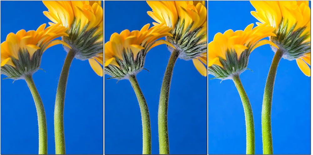
I had a play with your Two Gerbera shot to see what more could be pulled out of the shot. Frankly I was amazed I know its down to personal taste, but my feeling is that its possible to give the shot a lot more punch and as you asked the question yourself as to whether it popped, I suspect you felt it needed something.
The comparison pics below, show what can be done. As you have Lightroom, I'd experiment with the shot by playing with the controls there. The 3rd version was altered there using the Tone Curve and HSL sliders. LR really is a fantastic program for this sort of thing. The 2nd shot was done using a plugin I have, but I'm keeping that under wraps for the moment
While blue and green are able to compliment each other I feel that in this case the b/g is dominating the whole thing. This is probably down to the positioning of the flower heads .... the stems don't have enough impact on the blue b/g
The colors are matching in my opinion Josh.
What it doesn't seem to match according my opinion, is the f11 you have choosen.
I would personally use f8 or f7.1 and faster shutter,not to blur out partial flower detail.
The colors are matching in my opinion Josh.
What it doesn't seem to match according my opinion, is the f11 you have choosen.
I would personally use f8 or f7.1 and faster shutter,not to blur out partial flower detail.
George
What you seem to be suggesting George would in fact produce more out of focus area. I would have gone to f.16 personally, to increase the depth of field
Thanks all, it's great to get constructive critique. there is no one in my house who critiques, so to get challenged is cool.
Stephen, thanks for the work on the pictures I will go back to lightroom. I do have a 550ex flash and will look at using that in combination with natural light.
Pops and george, thanks for the comments as well. They will help next time.
What you seem to be suggesting George would in fact produce more out of focus area. I would have gone to f.16 personally, to increase the depth of field
Stephen,
F11 and F16 is suggested mostly for human portraits not for flowers as it will clear the background that needs to be blurred.
Besides that, DOF is not only affected by aperture but also from subject distance, focal length and sensor format.
F8 or even down to 4.8/5.6 is sufficient to get a crisp clear picture of a flower without having a crisp clear background.
Anyway, experimenting does the job as different techniques exist.
George
It is best not to be prescriptive about such things, as you rightly say there are several factors that influence depth of field, so how anyone can say that a particular aperture is suggested is beyond me. In the case of Josh's Gerbera, the flower is clearly not all in focus, and if the aim is, as I suggested I would prefer, for it to be all in focus, then a greater aperture is needed, and in this instance the background would still be well out of focus.
We process personal data about users of our site, through the use of cookies and other technologies, to deliver our services, personalise advertising, and to analyse site activity. We may share certain information about our users with our advertising and analytics partners. For additional details, refer to our Privacy Policy.
By clicking "I AGREE" below, you agree to our Privacy Policy and our personal data processing and cookie practices as described therein. You also acknowledge that this forum may be hosted outside your country and you consent to the collection, storage, and processing of your data in the country where this forum is hosted.
 Tweet
Tweet
 [/IMG]


Comment