If this is your first visit, be sure to
check out the FAQ by clicking the
link above. You may have to register
before you can post: click the register link above to proceed. To start viewing messages,
select the forum that you want to visit from the selection below.
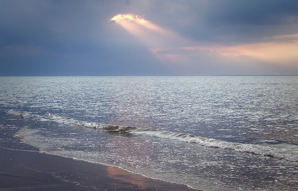
This was taken Aug '06 at Holme Beach, Norfolk - colours and hues "as is" and the only manip I've done is level the horizon and the speck in the sky is a seagull
I think this is just right for a book dust cover/book cover
Preamble To Sunset - hope you like (please be kind..... )
This was taken Aug '06 at Holme Beach, Norfolk - colours and hues "as is" and the only manip I've done is level the horizon and the speck in the sky is a seagull
I think this is just right for a book dust cover/book cover
Preamble To Sunset - hope you like (please be kind..... )
Nice first picture Andy, and you are to be congratulated on getting that horizon level The scene has some lovely pastel colours and hues, but I wonder if you could improve on what you have by adding a little more contrast.
Personally I would have lost the bird it serves no purpose except to annoy the eye. May I also suggest that you show the bigger version of the image by clicking on the small one and copying and pasting the UBB code into the post.
I look forward to seeing some more of your photography
I'll let the experts comment on colour but for me the horizon is in the wrong place for this image. It makes it appear that the photo has been cut in half.
Try cropping the sky to just below the seagull. You can see the effect it would have by scrolling this image up your screen until the seagull is out of shot.
The guys in here might not be kind but you are guaranteed honest critique with lots of constructive help
thank you for that stephen - long story about the original of this pic, but hey, first post and i'm sure i have others that make the grade - also i have tried differing contrasts and i always come back to this, it is one of my favs in so much as what you see is exactly what was in front of me on the day, apart from levelling the horizon, which in the original was me sinking in sand taking the shot
I'll let the experts comment on colour but for me the horizon is in the wrong place for this image. It makes it appear that the photo has been cut in half.
Try cropping the sky to just below the seagull. You can see the effect it would have by scrolling this image up your screen until the seagull is out of shot.
The guys in here might not be kind but you are guaranteed honest critique with lots of constructive help
i appreciate that Pops - my biggest failing is pic as is with as little manip as possible - but, to gain a better effect i'll crop and see what the result is, again thanks....
Like Pops "I'll let the experts comment on colour" What I want to say is; the first is always the scariest but it becomes less frightening more you post.
You'll get great tips, advice, help and constructive criticism on DPNow forums.
Brian
"The world is a book, and those who do not travel read only one page" St Augustine
Andy, I'm sure you are going to hate me for this but I rarely accept anything that comes straight from the camera, even if it is as it was exactly So I had a go at trying to give the image a bit of an edge. I agree with Pops so cropped the image below the bird. I then gave it gentle vignette by darkening the corners, but also increased the contrast in the centre using the same selection inverted. Finally ran it through Neat Image to reduce some of the noise in the sky.
This was taken Aug '06 at Holme Beach, Norfolk - colours and hues "as is" and the only manip I've done is level the horizon and the speck in the sky is a seagull
I think this is just right for a book dust cover/book cover
Preamble To Sunset - hope you like (please be kind..... )
Hi saracenandy,
Welcome to DPNow and there is no need to be scared.
We don't hold machine guns...just tiny cute sharp eraser blades...just kidding
Your photo can be improved if you adjust the contrast and clone out that "Dot Seagull".
Actually I tried to do some adjustments to your photo but whatever I apply to it the image degrades considerably. I saw that it is only 57Kb, meaning very high compression. I would suggest at that size images to be around 100-120kb.
I hope you accept all the comments in the vein they were given: to aid in photo analysis, see alternate perspectives, and maybe pass along some of an individual skill set. I've been around a few months and find all these people to be of a very positive and helpful mindset - good guys (with apologies to the fairer gender). Congrats on having the courage to take that first step and post. I know how that felt for me, and how much I gained from having made that post.
Enjoy DPNow and the community that makes it what it is! The more you participate, the more you will gain.
mmmmm, I dont usually comment on pics that dont intrest me, but seen as its your first, I will, very boring, laks impact, but hey your probly a great guy or gal that just loves taking pics, just like me 3 years ago. You have to soak up the crossfire, take in the wind and get out there. You will learn more from bad comments than good, and never take it personally.
Ash.
Lovely soothing scene, I can just about hear the sea. Nice to see a photograph 'before' the sunset. I do like the break in the wave just the right spot below the cloud. Oh, and welcome to the forum too.
Andy, I'm sure you are going to hate me for this but I rarely accept anything that comes straight from the camera, even if it is as it was exactly So I had a go at trying to give the image a bit of an edge. I agree with Pops so cropped the image below the bird. I then gave it gentle vignette by darkening the corners, but also increased the contrast in the centre using the same selection inverted. Finally ran it through Neat Image to reduce some of the noise in the sky.
We process personal data about users of our site, through the use of cookies and other technologies, to deliver our services, personalise advertising, and to analyse site activity. We may share certain information about our users with our advertising and analytics partners. For additional details, refer to our Privacy Policy.
By clicking "I AGREE" below, you agree to our Privacy Policy and our personal data processing and cookie practices as described therein. You also acknowledge that this forum may be hosted outside your country and you consent to the collection, storage, and processing of your data in the country where this forum is hosted.
 Tweet
Tweet


 )
)
 The scene has some lovely pastel colours and hues, but I wonder if you could improve on what you have by adding a little more contrast.
 but you are guaranteed honest critique with lots of constructive help

Comment